All About "your pal, sans"
I made this website because I needed an outlet for my obsession with Sans. Don't be fooled by its current lack of content... In my head, I have thousands of words waiting to populate all these pages— and more!
Fun fact: "Your Pal, Sans" can be abbreviated to YPS.
Design Notes
My first favourite thing is Sans. My second favourite is web design. I put a lot of thought into this layout and had so much fun making it. It took me about 12-16 hours, total. Every detail was carefully planned and executed... and I'm going to ramble about all of that now!
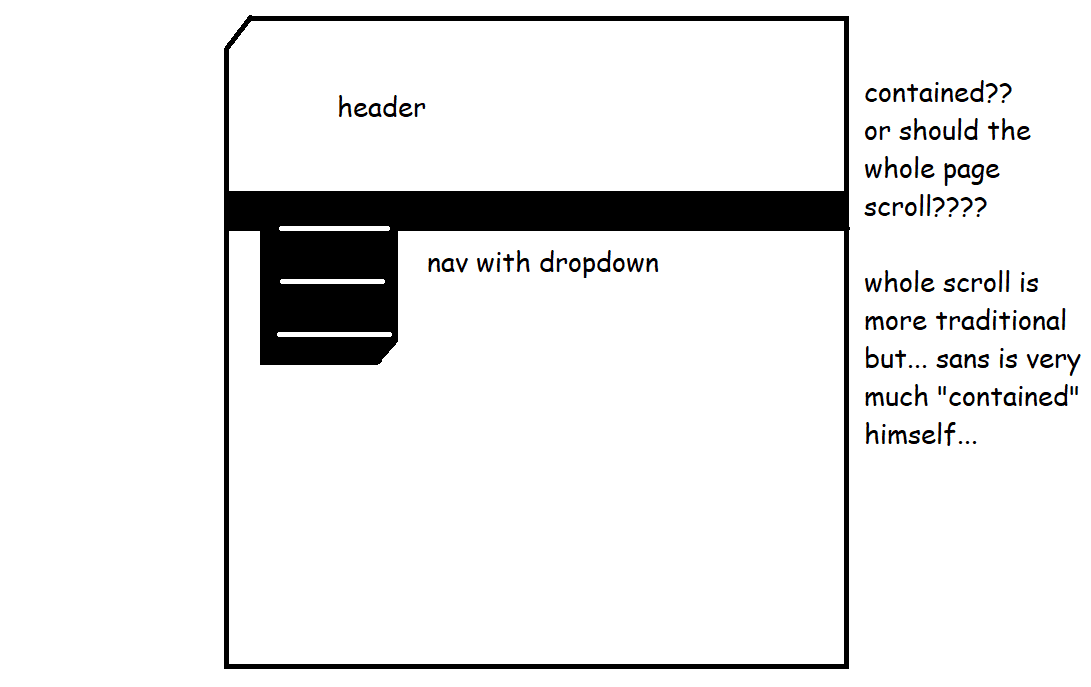
When I start a new design, I take to MSPaint to devise my plan. The layout is contained— meaning content scrolls within a box rather than enlongating the whole page— because Sans himself is a "contained" person. He's hard to read. His poker face barely ever slips and I swear it's because he knows just how much your facial expression gives away. His cute, permanent smile is one of his best features, so I wanted to honour that.
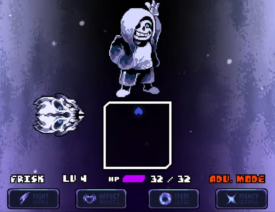
In traditional UTDR— and every other fan-made project I've seen— the bullet box is a square or rectangle with normal, 90° angle corners. So when I saw beveled corners in the DUSTTALE fan-game, The Genocide's End, I thought, "Whoa! How clever and unique!" I knew right away I wanted to emulate them in this layout. I'm glad for this bit of inspiration that kickstarted my design! Also, the battle theme "Blizzard Bolero" by Fazzy absolutely slaps. I love every song that guy makes.
The one downside to the beveled corners is that I made them with a CSS property called Clip Path. For complicated reasons, that means I can't have cute little Sans pixels peeking out from behind the main box. I coped with this by putting a snoozing Sans in the footer and attaching the trombone-playing sprite to the updates box on the homepage. I might add another sprite to the "quick links" boxes, too.
I chose a dithered, pixelated, digital-looking pattern for the background because... y'know... UNDERTALE is an isometric video game. It also looks a bit like JPEG artefacts or a graphical glitch, which reminds me some interpretations of Sans's teleportation powers. Here are some animations by Chimo V2. Look at the one in the center, which she calls "noise."
Look familiar? Hehe. Anyways, the background image fades from black to blue to cyan because those are Sans's signature colours. I wanted something minimal (because Sans is so understated) but also flashy— because he's absolutely spectacular when he wants to be. But we only get a hint of his powers in-game, so the cyan is just a little peek at the very bottom, after everything else has been exhausted....
It's great from an artistic standpoint, too. I wanted to balance the values between the background and the header. Like this, no part of the page looks too dark or too light, and you can easily focus on the bright white content box. I put a glittery aqua stripe down the left side because... well, that's just part of my style, I guess!!! It's an easy way to create intrigue where things would otherwise be plain. Meanwhile, the scrollbar on the right side is intentionally plain— practically invisible actually. It doesn't intrude upon the content.
The way the header image repeats on the X-axis reminds me of the timeloop that drives UNDERTALE's narrative. To be honest that was unintentional but, once I noticed it, I decided it was perfect. The ketchup drinking animation flanks the title because it's just so iconic. Also the red is a nice pop of colour. I don't use it anywhere else, so it's sure to draw the eye! My other accent colour is yellow, which of course matches one hue in Sans's flashing eye.
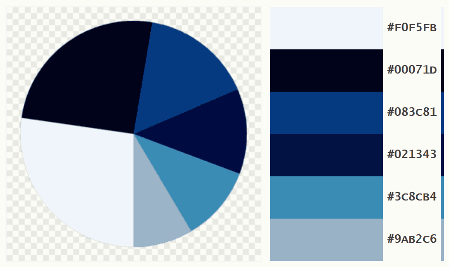
Here's a breakdown of the colour palette, courtesy of palettegenerator.com. Looks just like him, doesn't it?  I wanted to create something that truly embodies Sans's spirit and aesthetic, and I think I totally nailed it. Naturally, I decorated it with bones and sparkly stars. I used his signature font for the headings. I laid everything out so it'd be balanced, even, symmetrical, but not boring, and full of little suprises and delights everywhere you look. I just adore Sans so much. I think he'd appreciate the work I've done here. If he's gonna have a whole website dedicated to him, then this is how it should look!!!
All About Me
My name is Flonne Pocket and I'm deeply, deeply in love with Sans Undertale.In the context of this website, that's about all you need to know. Feel free to visit my personal website, Vivarism, to learn more.